
Research on Herb Lubalin: https://creativepro.com/herb-lubalin-and-expressive-typography/
Herb Lubalin (1918-1981) was worked for design magazine “Eros” in 1960s.He has received over 500 awards throughout his life. In 1939, works for the world exhibition in New York. In 1960s design magazine “Eros”, “Avant Garde”, “Fact”, “U & l” to the European and American graphic design has brought a huge impact, In 1970, the International Font Company (ITC) was founded in New York with Aaron Burns. In 1972-1981, teaching at Cornell University and Cooper Union in New York.In 1981, was awarded the highest honor by the American Professional Design Association.He and Sol Bass and Paul Rank are known as the greatest trio of graphic design in the United States.
Print Magazine cover.
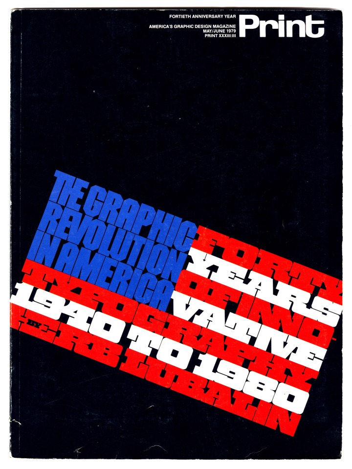
This full color cover with angle design creates a two-dimensional forms of motion. I noticed that the character of letter on the cover didn’t been twisted or enlarde. It just simply been slantwise. The form of letter is very interesting, he make typography become an american flag look-like. I found this design layout is clever and grace. The color of the typography has strong contract and pop up. The letters have different proportions, The letter in blue is higher propotion than the letter in red and white. So the blue letter will combine with red and white letter suitable. In the last row of red letter, there is black “by”on it. The “By” is very well with the last row of red letter. I think this move is very interesting and clever. It keep the row in order without lose any words of the information.
