
Research on Herb Lubalin: http://www.designishistory.com/1960/herb-lubalin/
Herb Lubalin is often associated with the typeface he created for the Avant Garde Magazine and their logo type. However, Lubalin could also be named one of the most influential art directors of the 20th century. His innovation and creativity with typefaces and logotypes for different magazines and publications is significant and highly influential. He worked for magazines such as Eros, Fact, and Avant-Garde, while also designing logos for other publications and organizations as well. He was a graduate of The Cooper Union and worked as a guest professor for a little while as well. The Lubalin Center now acts as a memory of him and a place to recognize the great works he accomplished. It also includes some other typographic artists as well, but the center is mostly devoted to Lubalin and his contribution to the world of design.
Lubalin’s “oh! & ah!” : https://readymag.com/flatfile/04-oh-ah/
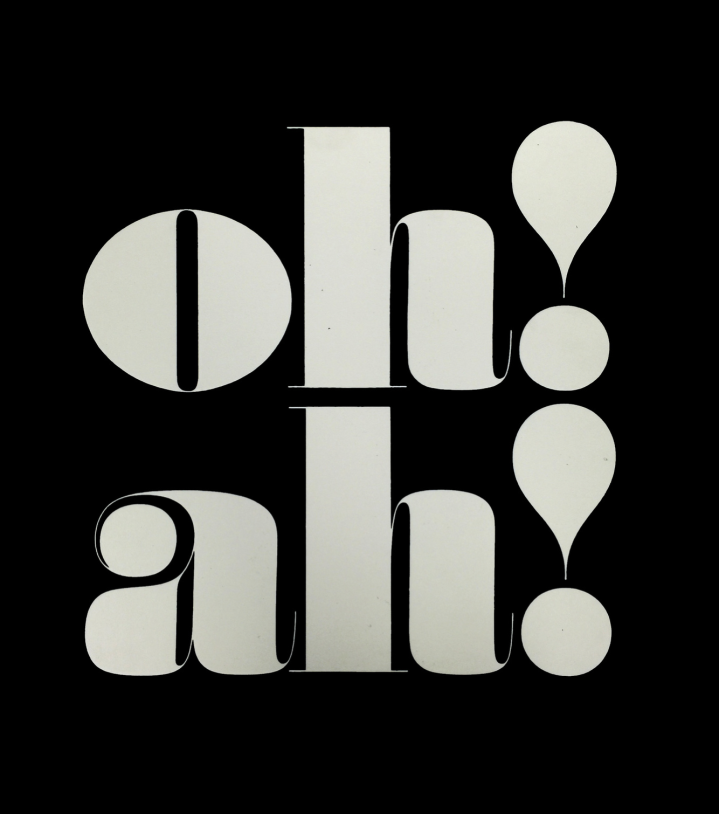
This design was used as a logo for Anthony Hyde, who was renting space out of Lubalin’s studio at the time. Lubalin designed the logo while Tom Carnase designed the typeface, using a 19th century Fat Face style.
One thing I find so interesting about this work is the modern elegance It holds, even though it was created in 1968. This logotype is timeless and could be used in many settings or publicans now. Although the “oh” and “ah” are the initials of separate people and were put on stationaries separately, they could very well go together as a graphic in a magazine spread, which goes to show the consistency of Lubalin’s style. The typographic style of this logotype is very bold, but not extremely geometric. It is very circular and many of the forms mimic that of a circle instead of a normal serif. This take on a serif brings fresh perspective and allows the notice serifs and strokes in a different way than with a slab serif or a regular, classical serif font.
POST FIELD TRIP CRITIQUE:
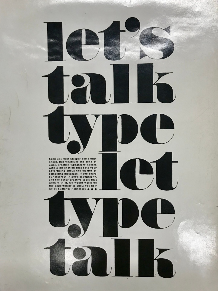
This is an advertisement for the creative firm in which Lubalin worked for, Sudler and Hennessey. Through its large form and size, this makes the viewer linger longer. In a way, this piece is very difficult to read, but that is what makes it so empowering. It automatically draws your eye towards the type and forces you to read it. the words themselves do not flow in correct sentences, but instead are phrases in which also are a little more difficult to read. basically, this ad makes the viewer do a lot of work. usually when the viewer is forced to spend a lot of time and thought interpreting an ad, it draws them away. however, this ad really draws the viewer in because of the intriguing typeface. this typeface really emphasizes the shapes and form of the letters, which is partly why it is hard to read. it also makes it a successful ad because there is a focus on the beauty and the empowerment that typography brings.
